Revamping ubuntu.com home
Repositioning Ubuntu as enterprise Linux for everyone
Timeline
May → October 2026
Role
UX designer and project lead
Team
Visual designer, developer, content writers, executive stakeholders
Scope
Analytics, benchmarking, usability testing, project management
Overview
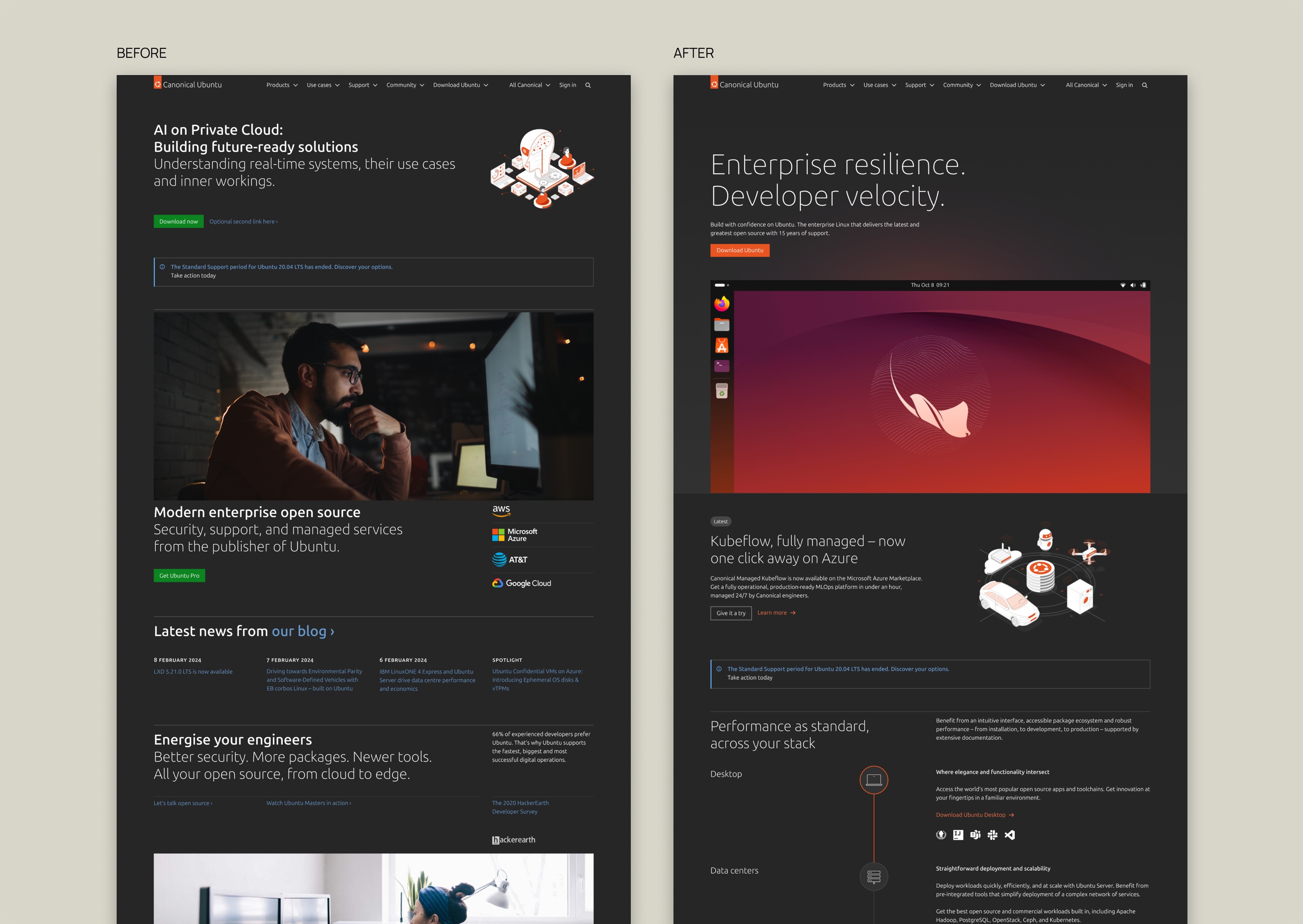
I led UX work for the redesign of the ubuntu.com homepage - from analytics and benchmarking to defining success metrics and usability testing. I managed delivery timelines across teams. Our visual designer led the UI work.
The problem
To position Ubuntu as an enterprise Linux product and showcase our portfolio, while refreshing the brand and shortening the overall page length.
Research
Users weren’t reading the page - they were passing through it
To understand how users were currently using the home page, I analyzed CrazyEgg heatmap and session recordings and Google Analytics. I found 3 main ways users were using the homepage:

Success metrics
Ensuring the rebrand improves the overall page experience
While the project was driven primarily by a need for a visual rebranding, I wanted to ensure our redesign went beyond that. Equipped with my research, I presented the current landscape to our primary stakeholders: the content team. We worked together to define what success looked like for this project.
| Metric | Current | Target |
|---|---|---|
| Engagement time | Engagement time was under half the site-wide average | Increase engagement time by 30-50%. We should increase engagement, yet acknowledge that a percentage of users will still primarily use the home page as a wayfinding tool. |
| Navigation path | Majority of our site visitors went to a download or desktop product page, either directly or within their session | As a primary action on this page, this should be monitored to ensure there isn’t a drop-off following the updates. |
| Pro page visits | A small minority of users went to Pro-related pages, either directly or within their session | There is no particular target metric here, but we will aim to see an increase in the conversions that go to ubuntu.com/pro. |
| Install page visits | A small minority reached install pages indirectly | Though not a primary action, this should be monitored to ensure there isn’t a drop-off following the updates. |
| Qualitative observations | N/A |
In addition to the quantitative metrics, the usability tests on the design should evaluate whether:
|
The solution
Scanning beats reading: how we supported this user journey
During user testing, I found that users indeed used the homepage as a wayfinding tool, as some participants gravitated towards the navigation bar immediately or merely scanned headings for keywords of interest.
The primary CTA on the homepage - downloading Ubuntu - was highly discoverable, with participants rating it an average 4.9/5 for ease of finding download links.
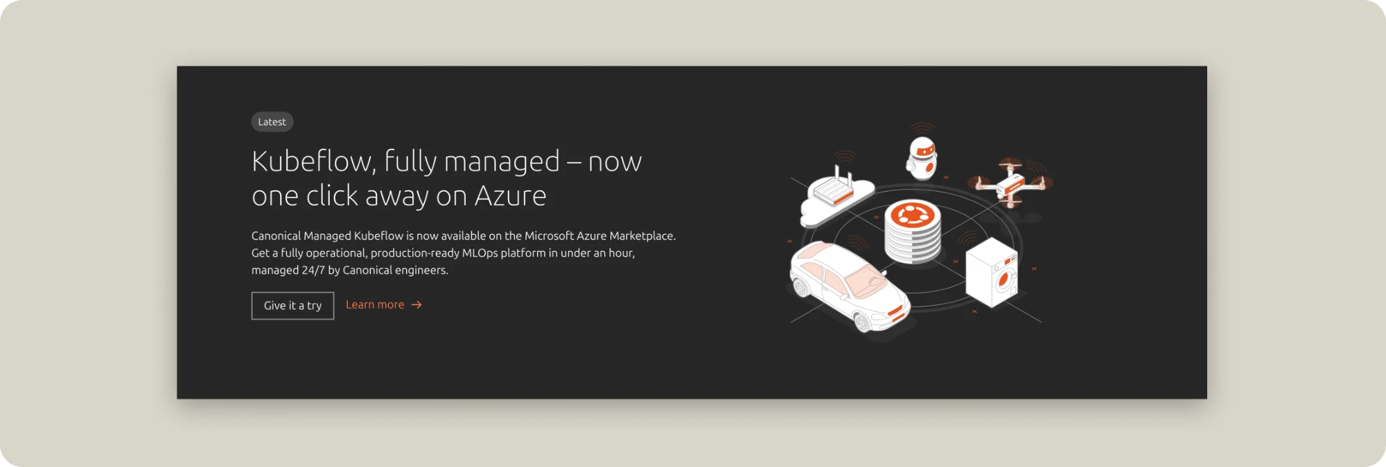
The featured marketing section as a point of friction
During testing, the featured marketing section caused the most friction as users felt it was disconnected from surrounding content. In the first iteration, this section was presented as any other content section on the page, which confused users. To alleviate this, we added a “Featured” label to signal this was temporary, rotating content.
This finding led me to initiate a proposal for an additional project in the following roadmap to improve content guidelines for this banner across our two sites.
Balancing enterprise, developer and everyday audiences
One of the biggest challenges we faced was balancing our messaging with different groups of users in mind. The home page attracts users from various backgrounds with different intents. With a heavy focus on enterprise messaging, we had to carefully balance our messaging to developers and end users without feeling overly technical to non-technical users. During our usability tests, I found that the animation in the hero was the most emotionally resonant element for developers, with one participant saying:
“This feels a bit more made for me”
The video carousel and rotating text section, with pieces of information targeted to different user groups, also captured a lot of attention.
Impact
The page has recently gone up on ubuntu.com! Metrics to follow.
Learnings
Presenting research early and building success metrics early
I took the opportunity to share CrazyEgg web analytics and GA4 data early on as a way to involve stakeholders in agreeing on success metrics together, so we were synced on our definition of done for this project. This also helped our stakeholders have data points to reference in their process of refining and providing content for the page.
Using different mediums to provide research feedback
To close the gap that research projects often face between deriving conclusions and having actionable feedback, I provided insights in various mediums. For the visual designer, I provided feedback in sticky notes on FigJam, making it easy for them to pick up on changes to be made. For content team members, I provided a written report to better communicate the nuance in the comments made by test participants.